london city lionesses
Built for a club on the rise




services
brand identity
guidelines
art direction
credits
mark bennett, creative director
simon fordham, client director
sonja fritz, junior designer
London City Lionesses have never followed the traditional club model. Independent, ambitious and building their own history, the club needed an identity with the confidence to match where it was heading.
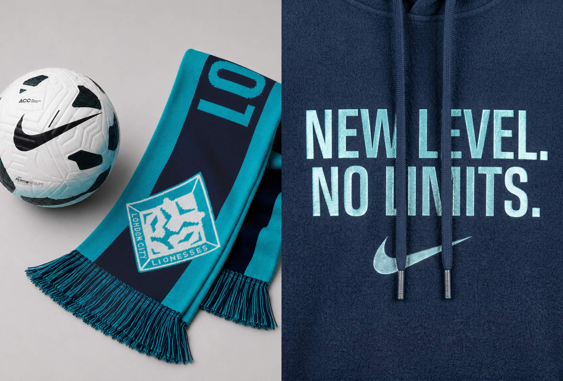
Working alongside Hey!BigMan, MIDFIELD helped shape a new visual direction centred around the crest, inaugural kit and digital presence. From there, the identity expanded across matchday, campaigns, social, photography and the club website, creating a more consistent expression wherever supporters encountered London City.
The system was built with growth in mind. As the club has moved forward, including promotion to the Women’s Super League, the identity has been able to move with it.