adidas originals
Finding clarity between the classics




services
art direction
brand identity
credits
azelle rose harris, maia agency
fonts
monument grotesk — abc dinamo
There’s very little you need to add to a Stan Smith.
Decades spent moving between tennis, fashion and culture have made it one of adidas Originals’ most recognisable silhouettes. The opportunity was less about creating something new and more about understanding what had made it endure in the first place.
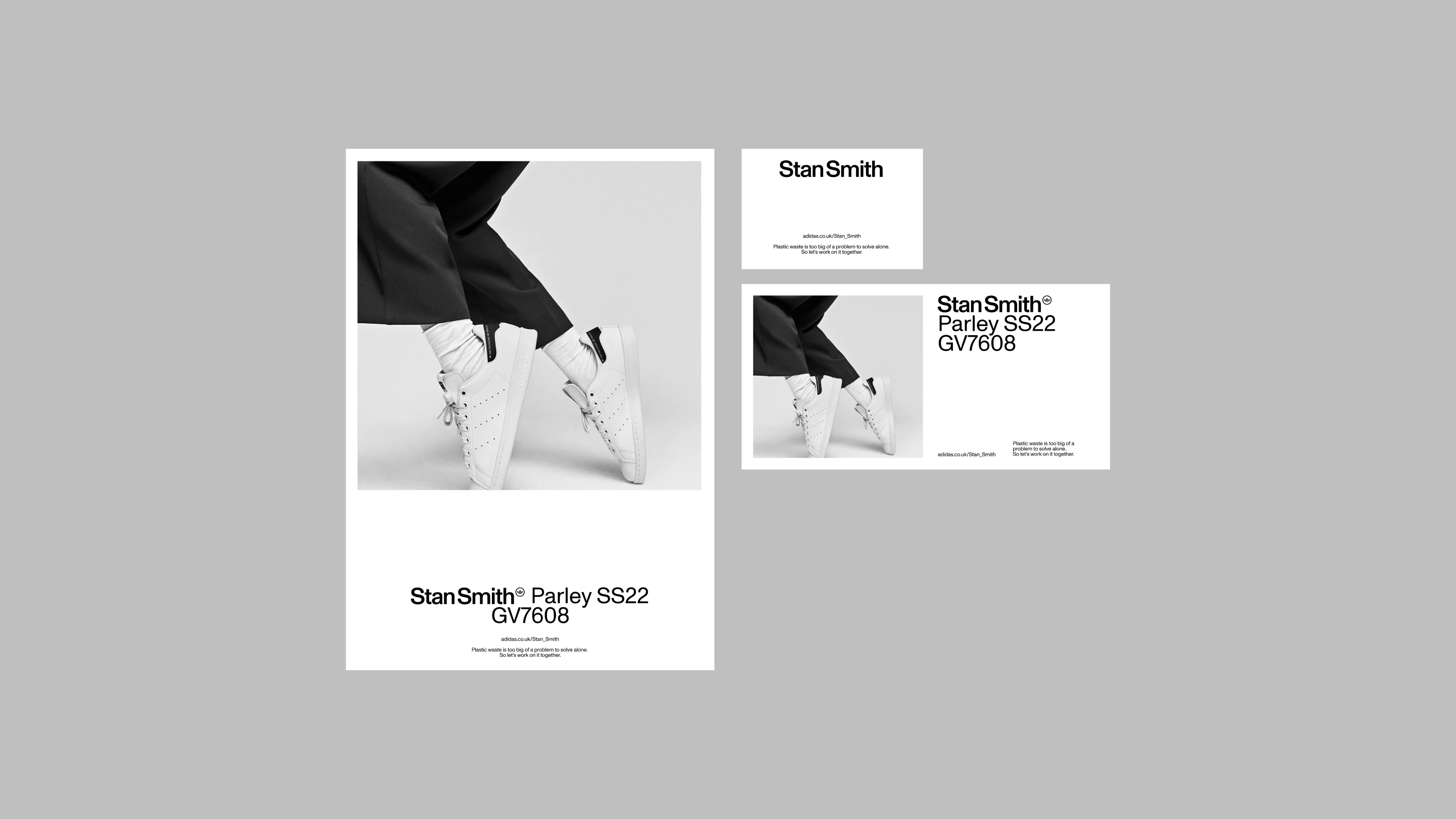
Working with MAIA, MIDFIELD helped develop a clearer visual framework for the franchise, taking cues from the simplicity and confidence of the shoe itself. Photography, typography, composition and campaign principles were stripped back to create a more consistent expression across markets.
The framework gave global teams something recognisable to build from without becoming overly prescriptive. An exercise in restraint for a product that has never needed to shout.